Right, you know that state in which you’re trying to get to
sleep but you’re not quite there yet but you’re also not quite awake? The most bizarre
thoughts come into your head and after a while you have to force your eyes open
to remember what the heck is going on. That is kind of my experience of
watching this animation.
It is disturbing on every single level. The only character
is this poor guy with a permanent smile (probably crying on the inside), who
lives in a little house. But I don’t if you’ve ever had the experience of
knowing you’re in a dream. But it’s kind of like, no matter how realistic the
dream is and how seemingly normal everything is, something isn’t quite right,
there’s something off. That is what I feel this character is experiencing in
this animation.
Firstly, the view through the window is pitch blackness,
same when he opens the front door. Secondly in this strange little world he
inhabits, there’s only one room. Our protagonist doesn’t seem too bothered that
he’s living in a vacuum and begins his day caring to his plants (not that they’ll
be able to grow without any sunlight).
He molds a new pot out of clay and then begins getting harassed
by a massive hand that smashes his work then molds a hand out of it. The giant
hand continues to harass our protagonist for pretty much the entirety of the
animation.
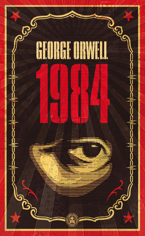
The animation alludes to the same issues bought up in George
Orwell’s 1984 about oppression. The hand wants our protagonist to build endless
other hands out of clay, the hand wants to destroy his creative freedom.
Whereas our protagonist just wants to create and grow new beautiful things. The
hand wants our protagonist to be its puppet and eventually the hand succeeds.
So I didn’t much enjoy this animation, mainly because it was
just so weird. I know it has a political point, but to me that doesn’t let if
off being too odd to watch. Jesus Christ.
Anyway moving on. The Hand was not the only focus of the seminar, the other focus was continuing with the concept of visual language and we were looking at examples of imagery that help us to understand how we perceive certain images.
For example we looked at this image of the album cover for the album 'Party Music' by The Coup. When the images first appeared on screen it was met with much criticism particularly targeting the subject matter.
None of us had ever seen this album cover before and knew nothing about it yet were still offended by it. Not just because it presented an image of two artists blowing up the World Trade Centre which is offence anyway but also because of how it is presented. Students commented that the title is way too close to the side of the cover and that the image is too busy which makes it very messy.
Then we found out that in fact the image was not created after 9/11, which is what we had just assumed but in fact the image had been created the month before. After hearing this our perceptions of this album cover completely changed and we now did not know what to think of it.
Review of The Hand
Right, you know that state in which you’re trying to get to
sleep but you’re not quite there yet but you’re also not quite awake? The most
bizarre thoughts come into your head and after a while you have to force your
eyes open to remember what the heck is going on. That is kind of my experience
of watching this animation.
It is disturbing on every single level. The only character
is this poor guy with a permanent smile (probably crying on the inside), who
lives in a little house. But I don’t if you've ever had the experience of
knowing you’re in a dream. But it’s kind of like, no matter how realistic the
dream is and how seemingly normal everything is, something isn't quite right,
there’s something off. That is what I feel this character is experiencing in this
animation.
Firstly, the view through the window is pitch blackness,
same when he opens the front door. Secondly in this strange little world he
inhabits, there’s only one room. Our protagonist doesn't seem too bothered that
he’s living in a vacuum and begins his day caring to his plants (not that
they’ll be able to grow without any sunlight).
He molds a new pot out of clay and then begins getting
harassed by a massive hand that smashes his work then molds a hand out of it.
The giant hand continues to harass our protagonist for pretty much the entirety
of the animation.
The animation alludes to the same issues bought up in George
Orwell’s 1984 about oppression. The hand wants our protagonist to build endless
other hands out of clay, the hand wants to destroy his creative freedom.
Whereas our protagonist just wants to create and grow new beautiful things. The
hand wants our protagonist to be its puppet and eventually the hand succeeds.
Review of Surogat
Right so this wasn't quite as weird to watch as The Hand, although that didn't mean I didn't become uncomfortable watching it. This little triangle guy that can't stop singing an annoying tune that really starts to grate after a while arrives in the middle of nowhere and then starts to inflate an entire beach out of shapes he got from his car.
He then inflates a female character who many would now regard as offensive and misogynistic. The reason for this is because her entire body shape is designed to be overtly sexual and appealing to the male character. I feel this would be ok, had the male character been designed the same way, but he hasn't. The male character is just a triangle, there's not much sexual about him at all (admittedly he does wave his arse around a lot).
The female character in Surogat sort of reminds me of Jessica Rabbit from Who Framed Roger Rabbit, a film made many years later. She too is designed in a way that is sexually appealing to a certain kind of person, e.g. ridiculously large breasts. But to me I feel that character works in that movie because that's kind of the joke that this cartoon character is appealing to live-action characters. I could be wrong about that. Jessica Rabbit could well be an offensive character because of the way she is presented.
Either way in this day and age, watching something like that you can't help but feel that aspect of the cartoon just wouldn't have been created today. Plus when the male character advances on the female character and she refuses, he then proceeds to almost force himself on her which in this day and age, even in a cartoon, isn't really ok. I don't know who this animation is aimed at, I'm hoping not for children.
That's not to say I completely disliked the animation. I certainly enjoyed it more than The Hand. It's often very creative, the character designs while often slightly offensive are very memorable and unique. I particularly liked the design of the male surfer. I also like that he is presented in a way that is sexually appealing to a certain type of person, for example he's in amazing shape and he's shirtless. So in that respect the sexualisation isn't entirely one-sided. Plus the idea of this character creating an entire world of his own just out of a few shapes is also very interesting and I would have liked to see this concept pushed further.
Overall, there's good things in it. But there are just certain things that become too distracting about the animation that actually stops you from enjoying it a lot of the time.


 A picture of an apple.